The nuances of glazing colour
by nithya_caleb | July 11, 2018 10:14 am
 [1]
[1]By Kevin Ramus
As one of the world’s most versatile building materials, with a wide range of esthetic options and outstanding energy characteristics, glass provides numerous opportunities to enhance buildings’ visual appeal and performance. As glass panels and insulating glass units (IGUs) become larger and glass occupies more real estate on curtain walls, storefronts, and interior building components, ensuring colour uniformity and consistency across the façade becomes both challenging and critical.
It is important for architects to be aware of and attain colour uniformity with glass. This can be facilitated by becoming familiar with the globally recognized L*a*b* colour system developed by the International Commission on Illumination (CIE, Commission internationale de l’éclairage). It is also helpful to address related glazing-colour specifications and proven glazing-sample viewing techniques for more effective colour evaluation.
Measuring colour in glass
Colour uniformity of glass in an architectural application can be defined as variation in appearance of the colour or shade within one glazed unit, or between multiple glazed units of the same type installed in the same plane and elevation of a building. However, as discussed later in this article, the appearance of visually perceived colour differences within or between installed glazing units does not necessarily mean colour uniformity requirements as manufactured have not been met. This is where measuring the actual colour of glazing units comes into play—a process beginning with measurements taken during the glazing manufacturing process. For the proper context, however, one should first define what colour is before addressing the topic of colour measurement.
For the purposes of standardization in the manufacturing sector, colour is typically defined according to a mathematical model developed by CIE. This globally recognized colour system numerically defines the colour of glass (or any object, for that matter) with three vectors in a three-dimensional colour space:
- L* (luminance: lightness to darkness);
- a* (green to red); and
- b* (blue to yellow).
As seen in Figures 1 and 2, the L* values range from darkest to lightest (0 to 100) in this model. Positive a* values are more red, while negative a* values are more green. Positive b* values are more yellow, while negative b* values are more blue. Most glass and coated glass products—with the exception of painted spandrels—are fairly neutral in colour and have L* values ranging from 20 to 97 and a* and b* values ranging from –10 to +10.
For example, a commercially available tinted glass appearing light blue has a transmitted colour of:
L*= 80.0
a*= –4.8
b*= –10.0
By comparison, clear glass appearing slightly green commonly has a measurement of:
L*= 95.4
a*= –1.8
b*= 0.1
However, when a neutral-reflective, low-emissivity (low-e) coating is applied to the second surface of clear glass in an IGU, the typical clear colour changes to a new measurement of:
L*= 74.1
a*= –4.7
b*= –3.2
In this case, when looking through the glass in transmission, it takes on a somewhat darker bluish-green appearance.
The specified slider does not exist.
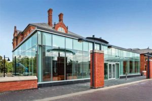
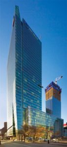
 [2]
[2]Photo © Tom Kessler Photography
Colour measurement
Glass is a unique material in that it has a transmitted colour (i.e. what is seen looking through the glass) and a reflected colour (i.e. what is seen looking at the glass, usually with some viewing angle). Therefore, the eye sees a blending of both the transmitted and reflected colours of the glazing simultaneously.
A spectrophotometer—a sophisticated instrument made up of a known light source, a sample holder or port, an integrating sphere to collect light, and a known light detector—is used to measure an object’s colour. Most spectrophotometers can measure both transmitted and reflected colour and have built-in software to calculate the measured colour of an object and provide numerical L*a*b* data, which can then be accurately compared to the colour of other objects without any subjectivity.
Glazing colour uniformity is formally defined or referenced in several industry standards published by ASTM International. ASTM C1376, Standard Specification for Pyrolytic and Vacuum Deposition Coatings on Flat Glass, and ASTM D2244, Standard Practice for Calculation of Colour Tolerances and Colour Differences from Instrumentally Measured Colour Coordinates, are the building glazing industry standards. They utilize L*a*b* colour measurements with the spectrophotometer oriented perpendicular to the glass surface.
ASTM C1376 sets the limit of the exterior colour uniformity range for pyrolytic- and vacuum deposition-coated flat glass both within a single glazed unit, and from one glazed unit to the next. It is important to note visually observable differences are possible within this specified range and and in conformance with the standard. ASTM C1376 also notes glass may have a perceived colour difference when viewed at various angles. This is a common phenomenon and does not necessarily indicate a product deficiency.
How low-e coatings affect light and colour
Low-e glass is often specified for IGUs and curtain wall assemblies because of its ability to transmit light and diminish heat gain, thereby increasing the energy efficiency of buildings. This glass type is formulated with multiple ultra-thin layers of materials—mainly silver and other metal oxides—on the surface of clear and tinted glass substrates of varying thicknesses.
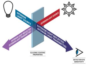 [3]
[3]Most often, this coating is deposited on the surface by magnetron sputter vacuum deposition (MSVD)—a high-tech process in which multiple nanolayers of heat- and light-controlling materials are applied to the glass surface one atom at a time. The optimal coating stack is only about 0.0002 times as thick as the glass lite onto which it is coated.
Chemical vapor deposition (CVD), an alternative, cost-effective coating process, is used more for adding tinted or reflective coatings, which can also have some low-e properties, to a glass substrate. The types of materials better suited to the CVD process are somewhat limited, and the coating layer thickness controls are not as precise as they are with the MSVD process. Therefore, the types of resultant coatings are also somewhat limited to tinted
and/or reflective, and the low-e properties are not as good as with silver-based MSVD coatings.
Even at these low levels of thickness, low-e coatings affect the light passing through, absorbed by, or reflecting off of them. The interaction between light, the coated glass, and the eye of the person looking at the glass relates directly to human perception of colour uniformity, as seen in Figure 3.
Low-e coatings can also increase the amount of reflection, which affects the perceived colour, especially when viewed from the building exterior. During certain conditions, such as a cloudy day, the reflected colour appearance may dominate, particularly when viewed against the dark background of an unfinished building interior. Ambient conditions also change with the time of day, as well as with the angle of the sun, depending on the viewer’s perspective, and whether one is seeing direct or indirect sunlight reflecting on the glazing.
However, once construction of the building is complete, the appearance of the glazing will change because the background and light coming from behind the glass emphasize transmitted colours and mute reflected colours. Consequently, colour differences visually perceived before construction is completed will often become more muted once the building is finished.
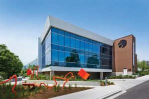 [4]
[4]Photo © Philip Castelton Photography
Colour differences and tolerances
Based on the unique colour target for each coated glass product, ASTM C1376 requirements for colour uniformity can be applied. For instance, if there are concerns colour uniformity requirements have not been met on the project site it is appropriate to compare the colour data for the glazing in question, measured with a spectrophotometer, to the colour data of glazing with an acceptable appearance. This colour measurement can be done pre- or post-installation on the glazing exterior by anyone trained in the use of a spectrophotometer made for such field measurement applications.
The colour difference equation can then be used to calculate the differences between two colour measurements for comparative purposes per ASTM D2244. This equation is referred to as DE*ab and calculated using the following formula:
![]() [5]
[5]
This formula can be used to compare the reflected colours of two low-e-coated glass samples, as in
this example.
The first sample’s reflected colour is:
L* = 33.0
a* = 4.0
b* = 2.0
The second sample’s reflected colour is:
L* = 33.5
a* = 5.0
b* = 4.0
The colour difference between them is calculated as follows:
ΔE*ab = SQRT((33.5-33.0)2+(5.0-4.0)2+(4.0-2.0)2) = 2.3
The calculation between a colour target and a colour measurement taken on a piece of glass can be done in a similar fashion. ASTM C1376 describes how the colour target can be obtained and used to determine colour uniformity. This allows glass colours to be compared objectively without the effect of ambient light, viewing angle, or an individual viewer’s subjective perception.
Colour uniformity considerations in glazing design
The early stages of glazing design and material selection are the optimal time to decide the appropriate level of specified glazing colour uniformity. The following factors related to the perception of colour need to be considered.
- Viewing glass samples against a white background emphasizes transmitted colour, while a very dark background emphasizes reflected colour.
As mentioned, glass installed on buildings includes components of both colour types blended together. - Glass samples should be evaluated in natural daylight, since artificial light may emit wavelengths of light that can skew the visual perception of glass colour.
- Perceived glass colour can be influenced by sample size. The colour of a 305 x 305-mm (12 x 12-in.) sample may not appear the same as a 1 x 3-m (4 x 10-ft) glazed unit of the identical glass. This is known as field-size metameric failure, which occurs because the relative proportions of the three cone types in the human eye (i.e. red, green, and blue) vary from the centre of the visual field to the periphery.
- Use of tinted glass on the outer lite—especially darker tints—masks much, if not all, of the colour differences in the low-e coating behind it. When low-e coatings are placed in front of darker tints, the opposite effect occurs and the coating colour differences are enhanced. Care must be taken when using dark tints to ensure consistent tin/air-side orientation in IGU or laminate assemblies.
- In some cases, low-e coatings developed and optimized for the second surface of an IGU can be placed on the third surface, but might have more colour. For solar control applications, a dark-tinted outer lite can lessen perceived colour variations when third-surface coatings are desired. An IGU with designated second-surface coating that is manufactured or installed accidentally backwards will have a noticeable colour difference, because the coating as installed is now on the third surface. The energy performance of such a “backwards-installed” glazing will also be affected.
- Coatings on multiple surfaces will have combined colour effects. For example, the colours of a low-e coating on the second and fourth surfaces are additive. Another example is low-e coatings on multiple surfaces of triple IGUs.
- Surrounding conditions—such as overhangs, shadows, and reflections from trees or other buildings—affect perceived colour uniformity.
- Building orientation, different elevations, and viewing conditions can affect colour perception. How direct and indirect sunlight shines on the glazing is determined, in part, by whether the building faces north-south or east-west. For example, north elevations tend to receive less direct sunlight and, therefore, more shadows; this can affect perceived colour.
- Glazing with exposed edges appears different to the eye because of edge lighting effects. With an exposed glass edge, light can enter the body of the glass through the edge and illuminate it.
- Interior shading devices and shadow boxes can affect perceived colour (Shadow boxes, an alternate design to typical spandrel units, generally consist of transparent glazing, a cavity behind the glazing, and an insulated back panel or tray, which can have colour and texture. They are typically used in nonvision areas of a building’s glass curtain wall design to obscure mechanical elements, between-floor voids, and other items designers may want to hide within a building façade. For more information on spandrels, click here[6]. ).
- Glazing constructed of different glass types—such as spandrels, laminated glass, and glass with dot/line patterns—can affect how the colour is perceived.
- Provided heat strengthening or tempering is done properly, the resultant colour is not affected.
 [7]
[7]Photo © Tom Arban Photography
The importance of using full-size mockups
As a blend of transmitted and reflected colour, glass colour is uniquely influenced by many factors, including light source, the properties of the coated glass, interior and exterior lighting conditions, viewing angle, glass size, and differences in human observers.
Thus, when evaluating glazing colour early in the project, it is recommended to use full-size glass mockups with multiple units of the same glazing type, ensuring all variables replicate those of the finished building and surrounding environment. It is best to review the mockups under various viewing conditions (e.g. exterior/interior, straight on/at angles, cloudy/sunny, blinds/no blinds, and with/without shading devices and reflections of adjacent structures/trees) with all project stakeholders.
It is advisable actual colour data be provided on the glazing used for the mockup. The mockup should be retained throughout the project as a reference of what was reviewed and approved for visual appearance. However, due to angular colour considerations, a mockup viewed at ground level with a limited number of glazing units might still appear somewhat different than the completed glazing curtain wall 30 stories above the ground. It is up to the glazing specifier whether or not the colour data for the mockup samples is officially requested as part of the submittal.
When evaluating glass samples, they should be viewed in natural daylight (not direct sunlight) rather than in an office environment due to the effects of artificial light previously discussed. It is also important to consider foreground and background when viewing samples, since this will influence what the eye perceives. Viewing the samples in the as-installed position (typically vertical), perpendicular to the glass surface, and at various angles provides a sense of the variation in appearance due to viewing conditions.
To obtain a true visual comparison when viewing multiple samples simultaneously, it is important to ensure the viewing angle, lighting, foreground and background, and other conditions are identical to the greatest degree possible.
Conclusion
Glazing colour uniformity is crucial to maintaining the desired look and architectural integrity of contemporary buildings. Although different observers will form their own unique perceptions of glass colours based on a variety of factors, it is critical for building owners, architects, contractors, glazing installers, glazing fabricators, and manufacturers to become familiar with the nuances of vision glazing colour by understanding the industry-standard L*a*b* colour measurement system. It is equally important to use full-size mockups to properly evaluate glass colour and to consider the environmental and viewing conditions, building orientation, and type of glazing being reviewed.
![]() [8]Kevin Ramus has more than 30 years of experience in the glass industry, primarily with automotive and architectural glass. Since 1989, he has been with Vitro Architectural Glass (formerly PPG Flat Glass) in numerous capacities, including manufacturing, sales, marketing, quality, and—most recently—technical support and service. Ramus holds a bachelor’s degree in ceramic engineering from Iowa State University. He can be reached via e-mail at kramus@vitro.com[9].
[8]Kevin Ramus has more than 30 years of experience in the glass industry, primarily with automotive and architectural glass. Since 1989, he has been with Vitro Architectural Glass (formerly PPG Flat Glass) in numerous capacities, including manufacturing, sales, marketing, quality, and—most recently—technical support and service. Ramus holds a bachelor’s degree in ceramic engineering from Iowa State University. He can be reached via e-mail at kramus@vitro.com[9].
- [Image]: https://www.constructioncanada.net/wp-content/uploads/2018/07/Humber-College-AviProtek-E.jpg
- [Image]: https://www.constructioncanada.net/wp-content/uploads/2018/07/Bow-05-Copy.jpg
- [Image]: https://www.constructioncanada.net/wp-content/uploads/2018/07/light-glass-sys-interaction091317-Copy.jpg
- [Image]: https://www.constructioncanada.net/wp-content/uploads/2018/07/Bird-Friendly-Glass-Pattern-215-AviProtek-11.jpg
- [Image]: https://www.constructioncanada.net/wp-content/uploads/2018/07/equation.jpg
- here: http://www.constructionspecifier.com/designing-spandrel-glass
- [Image]: https://www.constructioncanada.net/wp-content/uploads/2018/07/RBC-25-resized.jpg
- [Image]: https://www.constructioncanada.net/wp-content/uploads/2018/07/Ramus-Kevin-photo.jpg
- kramus@vitro.com: mailto:kramus@vitro.com
Source URL: https://www.constructioncanada.net/the-nuances-of-glazing-colour/