Seeing through rose-coloured glass
by Katie Daniel | March 8, 2017 10:47 am
 [1]
[1]Photo © Hal Ingberg
By Julie Schimmelpenningh
On a stormy spring evening in 2007, a marble panel fell from the 60th storey of Canada’s tallest building. Although no one was hurt, the event called into question the safety and durability of the building’s aging façade, made of 45,000 marble panels, each weighing around 100 kg (220 lb). It also sparked a multi-phase renovation project years later to remove and replace the marble panels with a material that would not only ensure safety and energy efficiency, but also give First Canadian Place a memorable facelift.
Today, many refer to First Canadian Place simply as the ‘White Building.’ In 2009, the building owner swapped out the marble exterior with 34,840 m2 (375,000 sf) of laminated glass featuring a white interlayer. Nearly opaque, the ceramic-fritted spandrel panels were chosen for their functionality and esthetic—they conceal both plumbing and HVAC systems running between the floors and have revamped the building with a modern, clean, and easily identifiable design.
As with the First Canadian Place remodel, many international designers are seeing the light when it comes to using laminated glass with coloured interlayers to work with a robust colour spectrum—from oranges to purples to greys—and ultimately re-envision a space.
When form meets function
Coloured interlayers for glass have the ability to transform ordinary buildings and interiors into statement pieces. By layering different sheets of coloured, transparent, and opaque interlayers between laminated glass, architects can choose from a palette of more than 17,000 colour combinations. These custom design options open up exponential possibilities for using colour in tandem with functional purposes such as safety, security, structure, acoustics, and solar control. Designers have experimented with colour in every type of building project imaginable, including façades, parking garages, schools, hospitals, offices, retail, and hospitality.
When most architects are looking to infuse colour into their design, they first focus on the visual effects. However, by employing coloured interlayers for glass, they can add in multiple product benefits. No matter what colour is used, laminated glass offers the benefit of added protection against glass shard fall-out and other architectural advantages.
 [2]
[2]Photo courtesy Macocco Vitrages
Safety first
Laminated glass consists of two layers of glass bonded together by a thin, durable plastic interlayer (polyvinyl butyral) under heat and pressure. The plastic interlayer protects against penetration and forced entry; it cannot be cut with glasscutters on one side. It also can sustain blows from stones, hammers, and bricks. In the event of an impact, the glass may crack—however, fragments tend to adhere to the interlayer, limiting the risk of flying or falling dislodged fragments of glass. This technology can safeguard pedestrians and occupants from the danger of glass breakage or fall-out. Laminated glass can also be used to improve protection from bomb blasts and high winds.
Environmental protection
Architects and designers can use these interlayers to help control the environmental impact of a space. Each interlayer is made with heat- and light-stable colourants, which help resist fading as the interlayer blocks out 99 per cent of harmful ultraviolet (UV) radiation up to 380 nm. The coloured interlayers can also reduce solar energy transmittance and aid in the management of heat buildup in the room.
Sound control benefits
Designers often incorporate laminated glass into a space for its acoustic benefits. Sound transmission
into building spaces generally occurs through the weakest element—typically, glazing constructed of ordinary window glass. Adding a single conventional or specially engineered acoustic interlayer significantly dampens sound transmission in the range of 1000 to 4000 Hertz (Hz), making the interior space quieter by reducing some of the most common noises such as road, rail and aircraft sounds.
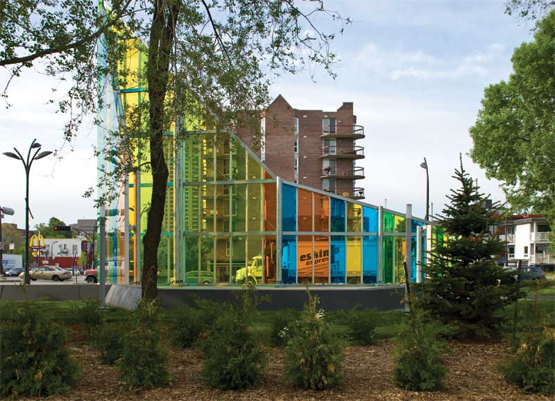
Colour for artistic expression
Artists from around the world have used coloured interlayers to create dramatic works, but few have been as prolific or successful as Canadian architect and artist Hal Ingberg. In the early design stages of his celebrated 2009 public art installation “Papa,” Ingberg began to experiment with samples of coloured glass interlayers. He saw coloured interlayers could create captivating visual effects with the way they filter and project light. He also saw the potential for a new interactive experience for Gatineau, Québec (see photo above).
Ingberg created a spiralled 14.4-m (47 ¼-ft) glass tower, leveraging the potential of coloured glass to affect the perception of work depending on the hour and the season. Located on the edge of city residences and a nearby park, “Papa” pops out from the urban landscape with vertical stripes of blue, green, and orange glass interlayers.
Working with coloured interlayers can require extra planning to anticipate how light interacts with the space season-by-season and hour-by-hour; as the angles of sunlight vary, the light filtering through the glass varies in intensity. In morning hours, “Papa” filters transparent and soft light. In the afternoon, the transparency appears more heavy and opaque. Yet at any time of day, pedestrians and cyclists pause to enjoy the interplay of colour, light, and shadows cast from the tower.
 [3]
[3]Photos courtesy Eastman Chemical Company
Curating an experience
Creative applications of coloured interlayers are inspiring architects and designers to rethink the ways colour can brighten and bolster a space’s function. While some may raise questions about coloured interlayers going out of style during a building’s 50-year life, the interlayers are proving to be an exceptional alternative to other hard-surface materials like painted glass, anodized aluminum, brick, dyed concrete, or marble.
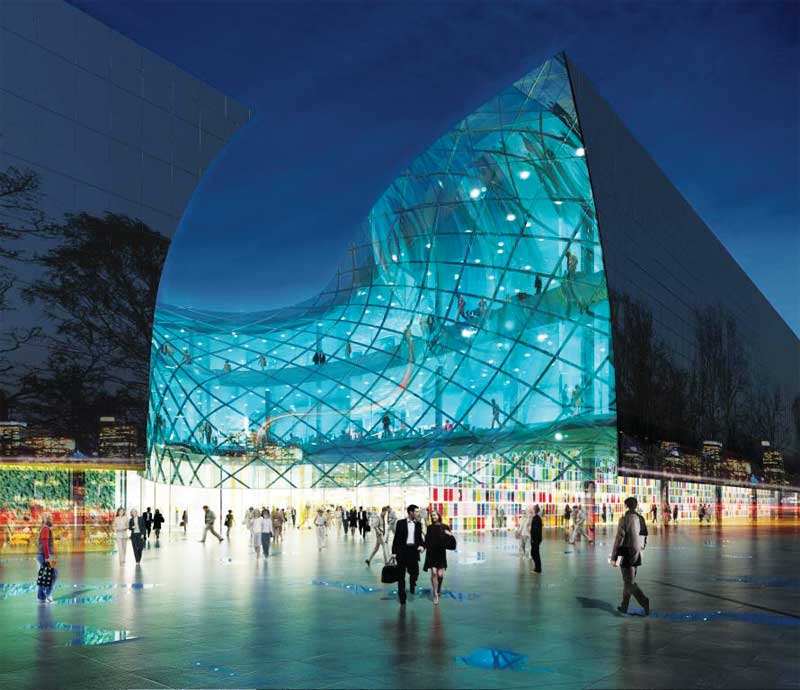
The Emporia Shopping Complex in Malmö, Sweden, for example, proves coloured interlayers offer astounding design capabilities as timeless as they are innovative. Built with 815 coloured-glass panels of varying sizes, the shopping centre is a curvaceous, fluid structure with two massive entrances enveloping guests in its fold—one entrance is made of marine blue glass, and the other is the hue of amber found on nearby beaches. The interior of the shopping centre glows with rainbows of staircases, walls, partitions, and other colourful structures.
As Joekim Lyth, office manager at Wingårdh arkitektkontor, describes, the project’s dynamic use of colour attracts patrons to a destination that is much more than a place to go shopping.
“We wanted to use colours in a functional way. What really interested us, of course, is how the weather affects the colour,” he says. “The sunlight [breaks] though the skylights. At night, the artificial light will make some of the colours glow. But that goes very well with our design intention that every experience should be unique. It’s the colour of light that will feed the space that’s really important.”
Similarly, the Philadelphia International Airport partnered with Darroff Design to create its new Terminal F. With the intention of making the terminal more of a destination for travellers, designers wrapped the terminal’s common space with a sky-blue laminated glass railing. This artful touch encourages busy travellers to slow down, enjoy the food court, and take in the beautiful display of public art.
Coloured interlayers especially serve businesses and organizations conscious of using design to communicate their values and services. This is the case at the Cantonal Bank Le Locle in Switzerland, where designers took advantage of the multi-functional features of laminated glass to create segmented glass partitions throughout the office space. In sections of the office where business transactions are held, the opaque glass sends a subtle message to customers that all bank relations are safe, secure, and private. Laminated glass is designed to disseminate and dampen sound waves by targeting those between 1000 and 3000 Hz—the range most sensitive to the human ear.
 [4]
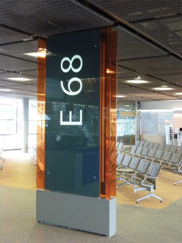
[4]Wayfinding support
Coloured glass also works as a compass. In France’s Paris Charles de Gaulle Airport, coloured glass helps note appropriate entrances and exits for taxis, cars, and shuttles. At the Centene Headquarters in St. Louis, Mo., it serves as a wayfinding guide to the rooftop entrance and exit.
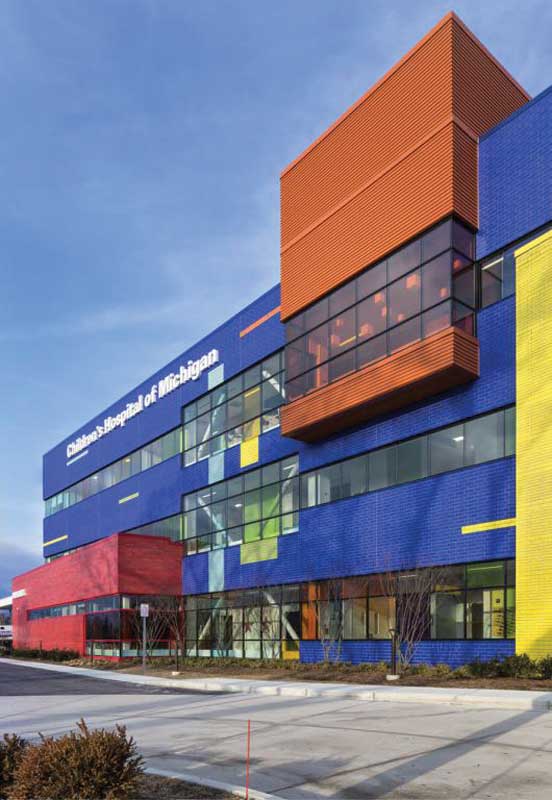
Indeed, coloured glass can also help patrons self-navigate through large and potentially confusing spaces. Architect Harley Ellis Devereaux used interlayered glass to create a child-like effect at the Children’s Hospital of Michigan in Detroit, which resembles a playful arrangement of three primary-coloured blocks. Each colour creates an intuitive grouping system that lets visitors know where they are in the hospital. Marked by red glass, the emergency room and its adjoining services stand out to help parents and patients quickly locate the right building in urgent situations. The main three-storey building is wrapped in blue glass, grouping together primary service functions and service spaces. The main entrance is marked with yellow glass for a warm welcome.
An increasing number of children’s hospitals are finding integrating bright colour makes the space more inviting and enjoyable for kids. In adult wings, softer colours can create a more serene and peaceful environment for healing.
Some college campuses are also colour-coding structures with disciplines—making all science buildings blue, for instance.
 [5]
[5]Colour as solar control
The Collège Anne de Bretagne in Paris, France, is crowned in a rainbow of coloured interlayers. Instead of using traditional solar-protecting windows, Philippe Gazeau Architecte chose coloured interlayers to shield the building from thermal loads while creating a dazzling spectrum of colour and light. The laminated glass technology reduces visible light radiation and protects students and faculty from the health risks of prolonged exposure to direct sunlight.
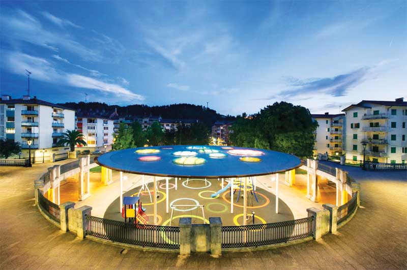
Safety and colour
Thanks to its shatter- and storm-resistant durability, laminated glass is a viable building material for covered surfaces and ceilings. At the local park José Miguel Barandiaran in the Basque region of Spain, architects model how laminated coloured glass can be applied as a playful skylight. The colourful overhead glass discs look like flying saucers to echo the space’s futuristic theme. Designed to be safe for playground visitors of all ages, the glass is a protective shield against all environmental elements.
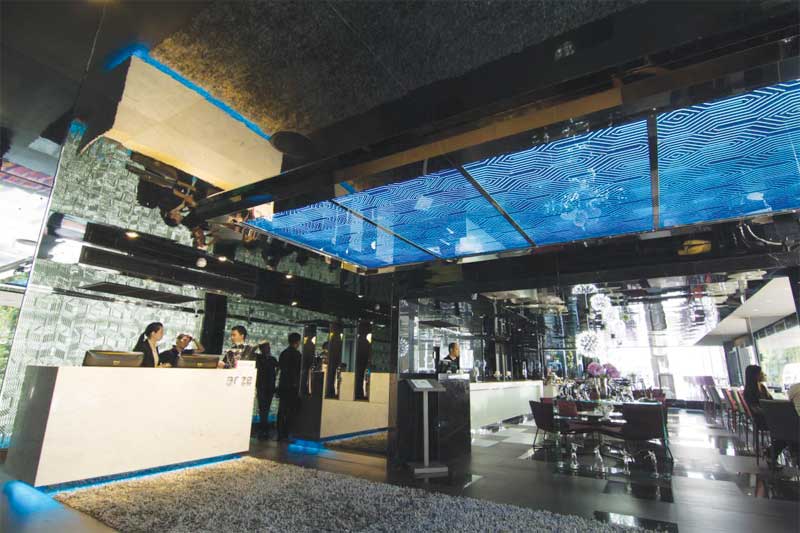
In another example, a dazzling blue glass overhang greets guests at the Arize Hotel Sukhumvit in Bangkok, Thailand. Just as much a focal point as a safety standard, the sapphire installation illustrates how the use of coloured interlayers extends beyond walls and ceilings to any overhead application.
Tips for selecting coloured interlayers
Coloured glass interlayers can add a bold esthetic effect to a space, but there is also an art to selecting the right hue to complement a design.
Start by considering the colour palette of the natural world surrounding the built environment
Many projects draw from the colours of nearby landscapes, mountains, and oceans to blend the interior with the exterior.
Ask the glass vendor about the quality of the glass
Ingberg points out gypsum drywall painted red will not have the same characteristics as red glass. Further, red glass will have different qualities depending on whether it is opaque, transparent, or reflective.
 [6]
[6]Use the same glass company
Consistency is always the first concern. For projects with large expanses or glass walls, it is important to note glass from Supplier A may have a completely different appearance than glass from Supplier B. Architects and designers are advised to get all glass from the same float line to maximize consistency and create a uniform design.
Remember it might take a few rounds of samples to get the desired colour
One must not be afraid to order as many samples as it takes to find the perfect hue. Finding that ‘perfect’ colour on a paper reference card will certainly look different than in a laminated glass sample.
Pay attention to labelling systems
Most companies offer RBG (i.e. red, blue, green combinations) or CMYK (i.e. cyan, magenta, yellow, and key [i.e. black] combinations) codes for almost every configuration they offer—up to three layers. A Pantone colour can easily correlate to a RBG colour—most computer software can correlate a Pantone colour to an RBG colour in order to integrate the colour into a building rendering and get an idea of how the final product will look.
Go with low-iron glass when using a white interlayer
All clear glass has a slight blue/green tint that can affect colour. Low-iron glass, while more expensive, is extremely clear and allows the crispness of the white to come through.
Do a mockup
When planning for a large expanse or building façade in a colour, most architects order a 1524 x 2286-mm (60 x 90-in.) panel or a 305 x 305-mm (12 x 12-in.) sample, depending on the size of the building. The mockup helps design professionals—and building owners—see how the colour changes in different daylight conditions, whether cloudy, sunny, or at dusk.
Keep it simple
Ingberg advises the use of several colours at a single time works best when the surface area of a project is large. Too many different colours on a small surface area can kill the effect.
| WHITE IS THE NEW COLOUR |
| White interlayers are a growing trend in Canada, where architects tend to be more conservative with colour. As a neutral base, white interlayers function to complement or subdue surrounding colours. The translucency also can create a calming, minimalist effect when used on their own.
In offices, whites are popular for interior use because they can add varying levels of privacy in conference rooms and meeting spaces. Whites offer ranges from high visibility light transmission (VLT), which gives a warm diffused effect to the glass, to mid-level 65 per cent light transmission. This would be just opaque enough to let faint shadows of figures show through. At the Cantonal Bank Le Locle in Switzerland, the multi-functional features of laminated glass were used to divide office space with glass partitions. In areas where business transactions are held, the glass serves as a sound barrier and the opaque visibility ensures customers that all bank relations are safe, secure, and private. One new design trend is the use of white glass walls and partitions as whiteboards. White glass is safe to use with whiteboard markers and easier to clean than traditional whiteboards. Facility managers prefer glass for its durability and cleanliness, as well as its economical and environmental savings compared to using reams of paper during large meetings. Many companies simply have staff members take a picture of the glass wall for their records at the meeting’s conclusion. (Of course, some facilities managers note employees just seem to love writing on the walls!) |
Julie Schimmelpenningh is the global architectural applications manager for Saflex, which offers the Vanceva Colour System—a specialized line of polyvinyl butyral (PVB) interlayers for laminated glass. She advises clients using the free online Vanceva Color Selector Tool to identify transparent, translucent, or opaque colours to enhance a space. Schimmelpenningh has been a glass industry activist for 25 years with experience in research and development, technical lamination processing, product, applications, and standard development. She is a participating member of ASTM, International Organization for Standardization (ISO), and Glass Association of North America (GANA). She can be reached at jcschi@eastman.com[7].
- [Image]: https://www.constructioncanada.net/wp-content/uploads/2017/03/Papa-3.jpg
- [Image]: https://www.constructioncanada.net/wp-content/uploads/2017/03/Paris-Charles-de-Gauelle-Airport-sign.jpg
- [Image]: https://www.constructioncanada.net/wp-content/uploads/2017/03/Childrens-Hosptial-1.jpg
- [Image]: https://www.constructioncanada.net/wp-content/uploads/2017/03/An-urban-park-as-an-UFO-.jpg
- [Image]: https://www.constructioncanada.net/wp-content/uploads/2017/03/The-Emporia-Shopping-Complex-.jpg
- [Image]: https://www.constructioncanada.net/wp-content/uploads/2017/03/Arize.jpg
- jcschi@eastman.com: mailto:jcschi@eastman.com
Source URL: https://www.constructioncanada.net/seeing-through-rose-coloured-glass/