Coloured glass stages a comeback

Photo courtesy Control Glass (Union Vidriera Group)
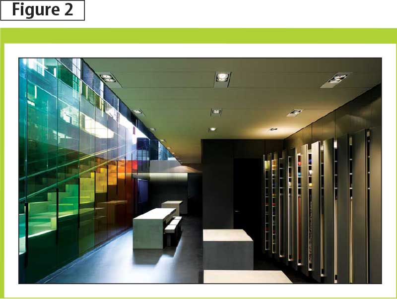
Photo courtesy KVADRAT
Setting a mood or tone
Studies have shown a correlation between colour and activity; certain colours encourage activity and enhance energy while others soothe and promote relaxation. (See “The Manchester Colour Wheel: Development of a Novel Way of Identifying Colour Choice and its Validation in Healthy, Anxious, and Depressed Individuals” by Helen R Carruthers, Julie Morris, Nicholas Tarrier, and Peter J. Whorwell. For more information, visit www.biomedcentral.com/content/pdf/1471-2288-10-12.pdf). For example, The Spa at Mandarin Oriental, in Barcelona, Spain, showcases the power of colour in a practical application (Figure 1).
Designer Patricia Urquiola lined the walls of this hotel/spa with glass that emits a soft, emerald glow. Participating with the facility’s deep wood floors and clean, simple lines, the coloured glass reflects soft lighting that is just as soothing as it is helpful for guests. Vast green walls work like a pathway as they unify the various amenities offered in the spa: deep lap pools, dimly lit steam rooms, and massage therapy.
Another European application shows off how a basic office space was supplemented with colour to add energy and edge to the workplace. Designer Petere Saville and architect David Adjaye collaborated on the new London headquarters of Kvadrat, a Danish textile company (Figure 2). A staircase of rainbow proportions cuts through the office foyer, casting a full colour spectrum against bricks walls, wooden steps, and sleek handrails. Stairs are a transient space, and therefore a ‘busy’ glass vertical design can be used because it is experienced in stages as a person ascends a staircase. A strong statement with a relatively simple design, the project is an ideal case study in how colour can ramp up the spirit of an old building.


Photos courtesy Thai Techno Glass
Strengthening the connection between building and landscape
When there is a predominate colour in the surrounding landscape, bringing it into the built environment can strengthen the connection between the exterior and interior. In Thailand, architect Pipupong Chaowakul (Thisdesign Co.) used coloured glazing for effect in a new shopping centre in the coastal city of Laem Chabang––a popular tourist destination.
The blue-green vertical colour palate of the Harbor Mall façade was inspired by the movement and feel of the waves in the nearby Gulf of Thailand. From inside the building, shoppers experience the changing colours of waves as they gaze through the gradient colour system into the sunlight (Figure 3). From the outside, the building’s marine colours beckon tourists who have come to enjoy the sea (Figure 4).
Generating exterior interest
The right colour in the right place can stop people in their tracks and encourage further exploration. Celebrated Montréal artist and architect Hal Ingberg used brightly coloured glass to create a public art installation, named “Papa,” in Gatineau, Québec (Figure 5). The peaked structure is made up of a series of vibrantly coloured glass panels that add brilliance to an ordinary intersection in the heart of Canada’s capital region in Québec.
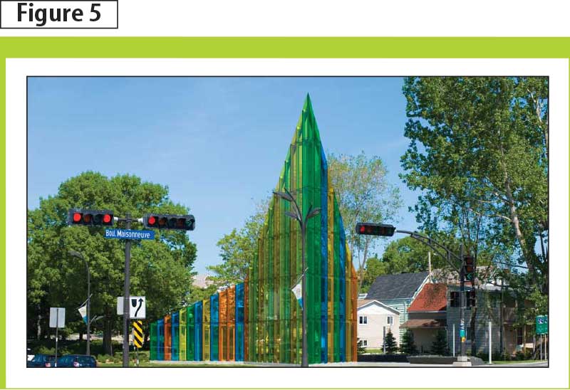
Photo © Hal Ingberg
A glass wall reaches a 14.4-m (47-ft) height at the park’s southwest corner, and was designed to act as a gateway to the city and its park, according to Ingberg. The installation spirals downward to 2.4 m (7.9 ft), inviting pedestrians and cyclists to sit and contemplate the ever-changing play of sunlight through the transparent, coloured glass. The dramatic use of coloured-laminated glass walls and spirals assures “Papa” as not only a major public art installation, but also a standard for the future of Canadian design.
Noted colour glazing specialist Andrew Moor often reminds clients a great deal of glass in buildings is more than just vision glazing. Spandrel panels, structural fins, stairwells, partitions, elevators, and even furniture can be created with coloured glass to add accent and rhythm into a facility while leaving the vision glazing clear.
Wayfinding
Colour can make it easy for people to find where they are going in the built environment. At Paris’ Charles de Gaulle Airport’s Terminal 2G, boldly coloured glass is used to help visitors identify the appropriate exits for taxis, shuttles, and parking. In St. Louis, Missouri, Centene Corp., uses a coloured glass outdoor canopy to guide building occupants to the entrance/exit to the parking structure.
Improving the experience of building inhabitants
A recent study by Helene Arsenault, BArch, March Herbert, PhD, and Marie-Claude Dubois, PhD, examined the effect of coloured glazing on the office environment.2 It investigated human responses to blue, bronze, and neutral curtain wall. Results indicate a preference for bronze glass––in terms of visual comfort, pleasantness, and light level. Participants in the study noted objects and textures in the presence of bronze glass were perceived as more natural and pleasant. Participants also preferred the colour and presence of daylight coming through bronze glazing.
The colour comeback
Some might call colour the ‘comeback kid’ in architectural glazing. In reality, though, interest in colour never really faded. The simple fact is technology finally caught up with that interest by combining the power and versatility of coloured architectural glazing with the high-performance characteristics required of today’s building products. As an increasing number of architects around the world understand and use pigmented interlayer technology, the future for coloured glazing looks bright indeed.
Aimee Davis is the Americas architectural business manager for Solutia Inc., a subsidiary of Eastman Chemical. She is also the global marketing communications manager for the company’s Advanced Interlayers division. A member of the International Colour Marketing Group (CMG), Davis currently co-chairs the contract colour division. Last year, she led colour-forecasting workshops at an international conference. Davis can be reached via e-mail at aldavi1@solutia.com.
Sign up for our weekly newsletter
Construction Canada weekly newsletters give the latest AEC industry news for those who build, design, engineer, specify, renovate or operate in the built environment.
Products & Services
Read the Latest Issue