Colour Considerations: Managing visual expectations for metal coatings
By Scott Moffatt
Metal coatings have come a long way. Not only have their protective and environmental qualities improved dramatically in recent years, but so have the range of colours and effects. Thanks to these new innovations and technologies, architects can choose from an extraordinary palette of decorative colours, glosses, and sheens for commercial office buildings, retail stores, and entertainment complexes.
While these developments are, on the whole, overwhelmingly positive, they also have heightened the need for more vigilant colour-matching and quality control measures on the part of coating applicators and their customers. As the number of coatings, glosses, and sheens have expanded, so have the opportunities for colour variation. Even subtle differences in hue, which may look negligible when building components reach the site, can be exaggerated when components are actually installed on a building.
This article is intended to help architects and other building professionals more effectively manage colour expectations so components arrive at their final location coated in the specified colour, and components produced by different coating applicators appear as a co-ordinated whole when installed on a building.
Avoiding the checkerboard effect
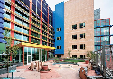
A new generation of coatings, incorporating natural materials such as metallics and micas, has helped contemporary architects create truly extraordinary buildings. Unfortunately, co-ordinating coatings across numerous building components can present difficulties that prevent architects from achieving their intended vision.
In most instances, the differences between the architect’s original vision and the finished coating on a building are minimal. In extreme cases, however, a number of small variations throughout the coatings process—from concept to finished product—can accumulate, producing noticeable and unacceptable visual differences among coated building components.
When installed on a building, these mismatched components may achieve a ‘checkerboard effect,’ which is a problem that can often be traced directly to the original colour specification. To minimize colour-matching problems at the specification phase, architects should be mindful of the following:
1. Colours chosen for a particular project are usually selected from a collection of printed chips or samples, then viewed in lighting conditions different from those in the field.
To achieve the most accurate match, colour samples should be viewed in what will be the coating’s finished building environment.
2. Time of day and time of year can also affect the appearance of individual colours.
Natural light is neither uniform nor constant, and its characteristics also will vary according to atmospheric conditions.
3. The height, angle, or distance from a light source can alter the appearance of a colour; so can its surrounding environment.
The colour on a building surrounded by trees will look different next to an open landscape, a highway, or another collection of buildings. This is also true of certain solid colours, micas, and metallics, which can reflect different appearances according to the surrounding light and the orientation of individual flakes.
4. The gloss and the surface character of the sample chip itself is important to consider.
One coating manufacturer may provide samples on galvanized steel substrate, while another may apply its coatings to an aluminum substrate. To ensure the truest colour representation, one should insist colour samples be coated on the actual substrate from which the building panel or extrusion will be manufactured.
Sign up for our weekly newsletter
Construction Canada weekly newsletters give the latest AEC industry news for those who build, design, engineer, specify, renovate or operate in the built environment.
Related Products & Services
Read the Latest Issue